
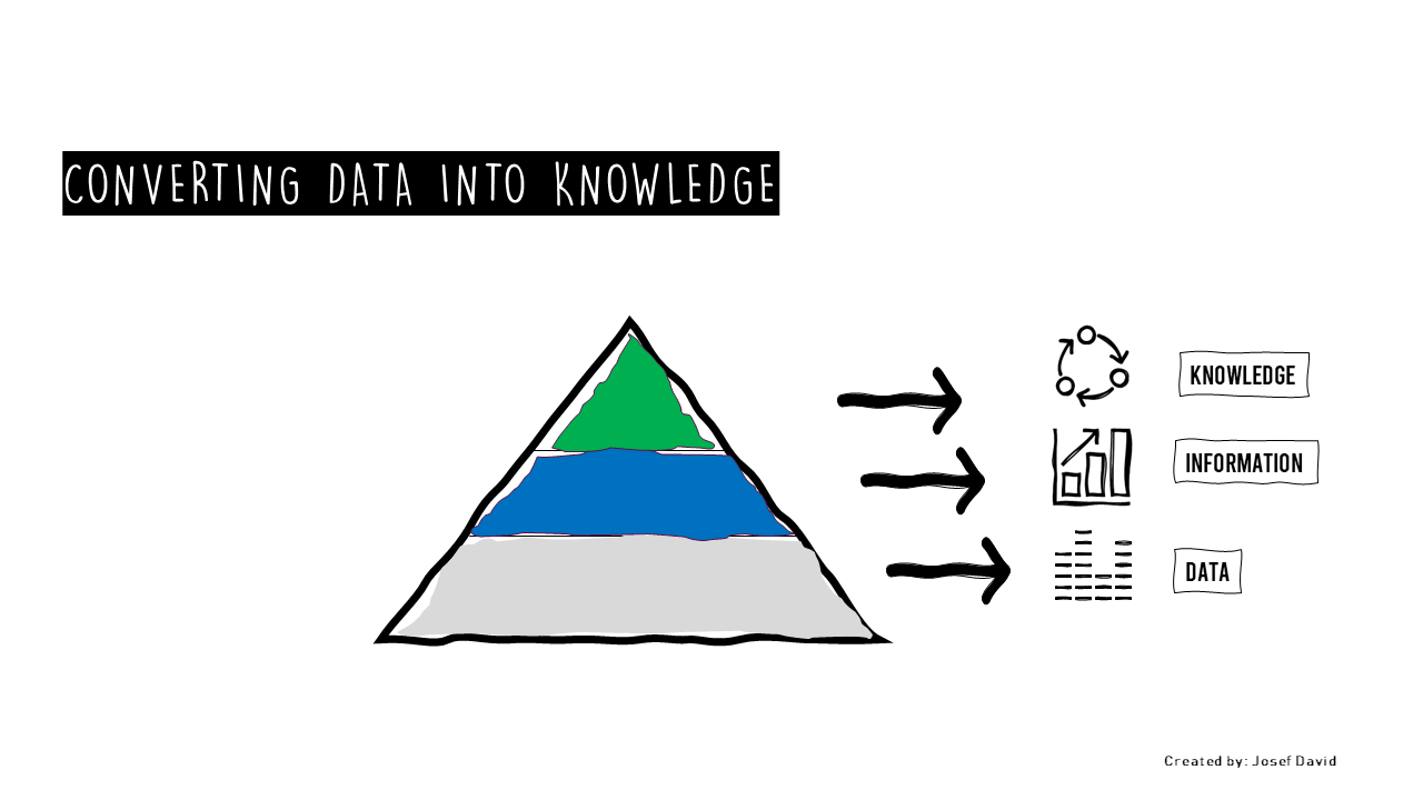
Cracking the Data Conversion Code: From Data to Information to Knowledge Using Storytelling and Visualization
In the digital age, we are inundated with data. It’s everywhere, from our social media feeds to our business reports. But how do we make sense of it all? How do we convert this raw data into meaningful information and, ultimately, into actionable knowledge? This is the challenge that many businesses face today. The inability to effectively convert data into knowledge can lead to wasted time, increased costs, and a decline in competitive advantage.
The solution lies in two powerful tools: storytelling and visualization. These tools can help us decode the complex language of data and transform it into a narrative that everyone can understand.
Let’s consider two case studies to illustrate this point.
Case Study 1: Bad Communication
Company A is a large corporation with a wealth of data at its disposal. However, they struggle to communicate this data effectively within their team. Reports are filled with numbers and jargon that only a few people understand. As a result, decisions are delayed, opportunities are missed, and the company’s performance suffers.
Case Study 2: Visual Communication and Storytelling
Company B, on the other hand, uses storytelling and visualization to communicate their data. They present their findings in clear, engaging visuals that tell a story. This approach makes the data accessible to everyone in the team, regardless of their background or expertise. As a result, decisions are made faster, opportunities are seized, and the company thrives.
So how can you implement a visual communication and storytelling system in your organization? Here are five steps to get you started:
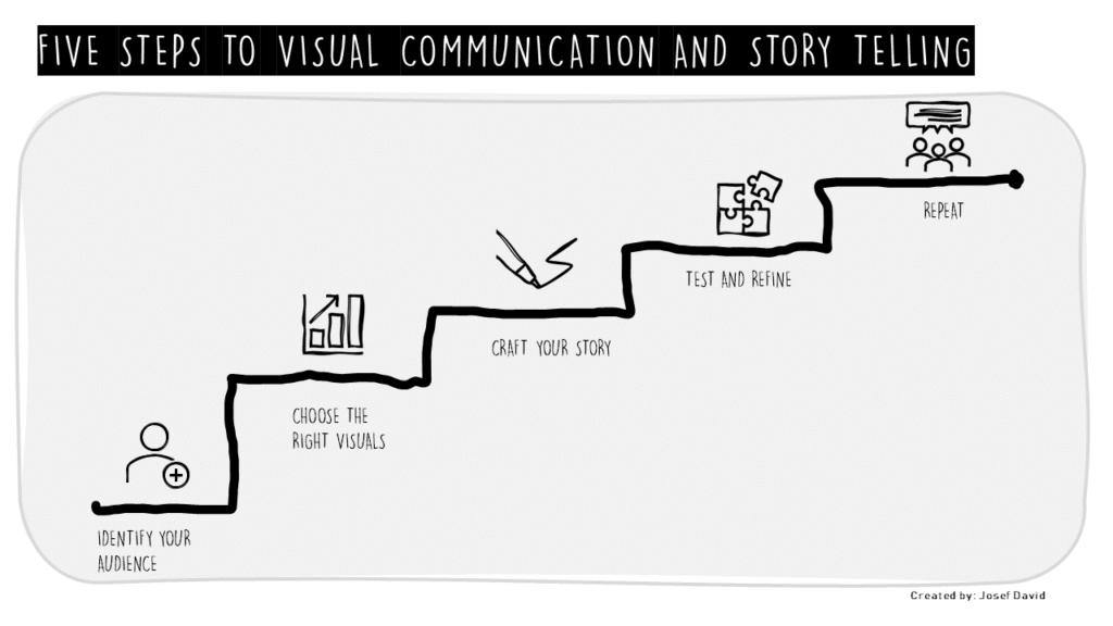
1. Identify Your Audience: Understand who will be consuming your data. What is their background? What do they need to know? This will help you tailor your visuals and stories to their needs.
2. Choose the Right Visuals: Not all visuals are created equal. Choose those that best represent your data and support your story. This could be a bar chart, a pie chart, a scatter plot, or even an infographic.
3. Craft Your Story: Every set of data has a story to tell. Find it and tell it. This could be the story of your company’s growth, the story of a successful project, or the story of a challenge overcome.
4. Test and Refine: Like any communication strategy, your visual communication and storytelling system will need to be tested and refined. Gather feedback from your audience and use it to improve your visuals and stories.
5. Repeat: The world of data is constantly changing. Keep updating your visuals and stories to reflect these changes and keep your audience engaged.
In conclusion, cracking the data conversion code is not an insurmountable task. With the right tools – storytelling and visualization – you can transform raw data into meaningful information and actionable knowledge. So why wait? Start implementing your visual communication and storytelling system today and unlock the full potential of your data.